Even on the B2B market visual content and emotions sale, not plain text.
Customers have no time to read tons of information, what they really care about is images, quality and design which helps them to make a decision whether or not to make a purchase on your store. First reaction and emotions gained from browsing your web page are often major factors impacting your overall success. About 61% of users silently leave websites, not optimized for mobile devices, even though you may offer the best pricing or product quality among your competitors. What an irony!
Nowadays, consumers combine research and shopping into one continuous process, across a range of devices. They may start on a laptop or tablet and continue the process on their smartphone or at online store. It’s one continuous customer experience process. Google research shows that [90% of multiple device owners][1] switch between screens to complete tasks online. Thus being mobile friendly is a key part of excellent customer service. Besides, new Google search algorithm includes mobile-friendliness as a ranking signal. Users will easier find mobile optimized websites to get relevant, high quality search results adopted for their devices.
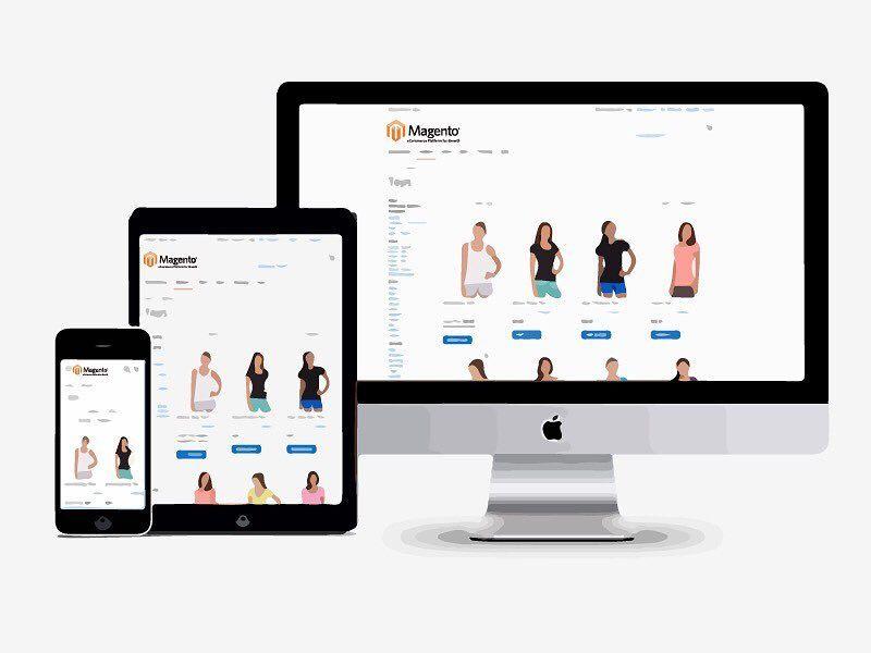
It's absolutely unimportant what type and size of store you are running as adopting Magento responsive web design is the best and major option to empower your mCommerce facilities.
To check your website for mobile friendliness you can take the [Mobile Friendly Test.][2]
- If your web store has already been optimized - Congrats! You keep up with the times!
- If Google test showed some issues - follow this [tutorial][3] on how to fix them or assign them to professional Magento developers who can provide effective Magento responsive design debugging. In any case you should have basic knowledges about Magento responsive web design (RWD).
So how to improve Magento responsiveness? How to optimize website for mobile?
Magento has a slow non-mobile GUI. There are two ways to make Magento a mobile friendly web store: To use responsive Magento themes To install Magento Mobile Extensions
The latest Magento version, widely known as Magento 2 is ready for new mCommerce requirements, it is clean and optimized for modern browsers and devices. Magento 2 interface is touchscreen friendly, which is a huge plus, and the screen is optimised for tablet and mobile. In Magento 2 the default theme is built based on a responsive web design approach. It adjusts to physical and software device capabilities and optimizes viewing and interaction experience across a wide range of smartphones, tablets, desktops and smart TV (Sky TV box, Playstation or XBox) screens.
Also Magento’s new version brings a totally new, mobile-friendly Administration panel. So alternative way to optimize Magento responsiveness is to migrate to Magento 2. With all its pros and cons Magento 2 has an undeniable advantage - it definitely provides awesome user experience both for customers and merchants across various devices.
Detailed guide on how to make your Magento theme responsive and mobile can be found in Magento docs.
How to implement responsive web design for Magento? You can create a mobile-specific theme using the default Magento approaches:
Create your theme (tips)
Important! Declare one of the Magento out-of-the-box Blank and Luma themes as a parent theme.
Add a <theme_dir>/Magento_Theme/layout/default_head_blocks.xml included:
Custom adaptive web design for Magento website can be implemented in various ways but keep in mind some points that make your website mobile friendly and provide high quality mobile shopping experience:
- Ensure your mobile store opens quickly. Use speed test tools to discover what improvements should be implemented and utilize modern technologies to improve performance.
- Use viable search indexing. Search results must be useful, so spelling auto-corrections, recognition of root words, predictive text, and suggestions offered to a user while he enters text, can help you you meet and exceed customer expectations.
- Provide full product details. Adaptive web design for Magento website should be clear and intuitive to understand. Users like it when retailers show all available product information: stock availability, sizes, color choices, descriptions, photos, etc.
- Ensure the customer control level of zoom.
- Display shipping costs and delivery dates on the item page.
- Allow user reviews to be viewed and filtered. Encourage consumers to generate own content like photos, Q&A, collated feedbacks.
- Allow shoppers to continue shopping after adding an item to the cart. Make sure that a confirmation message informing the user that the item has been added to cart is displayed.
- Let customers edit the cart while reviewing order details.
- Provide a detailed summary after the purchase is made.
Following all these recommendations you can analyze your web store and if you find any gaps, we will find a custom solution for you.